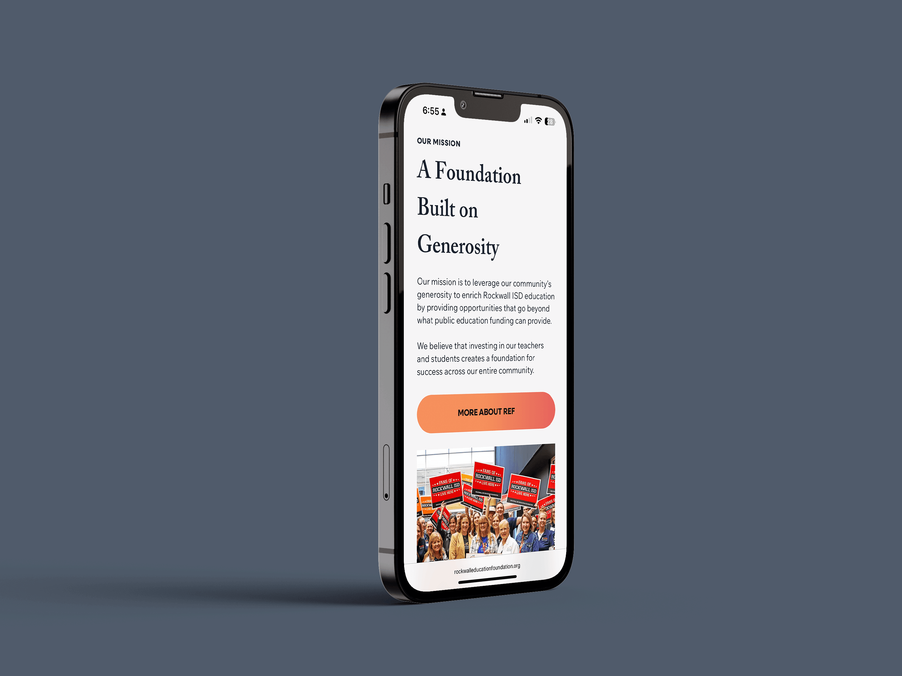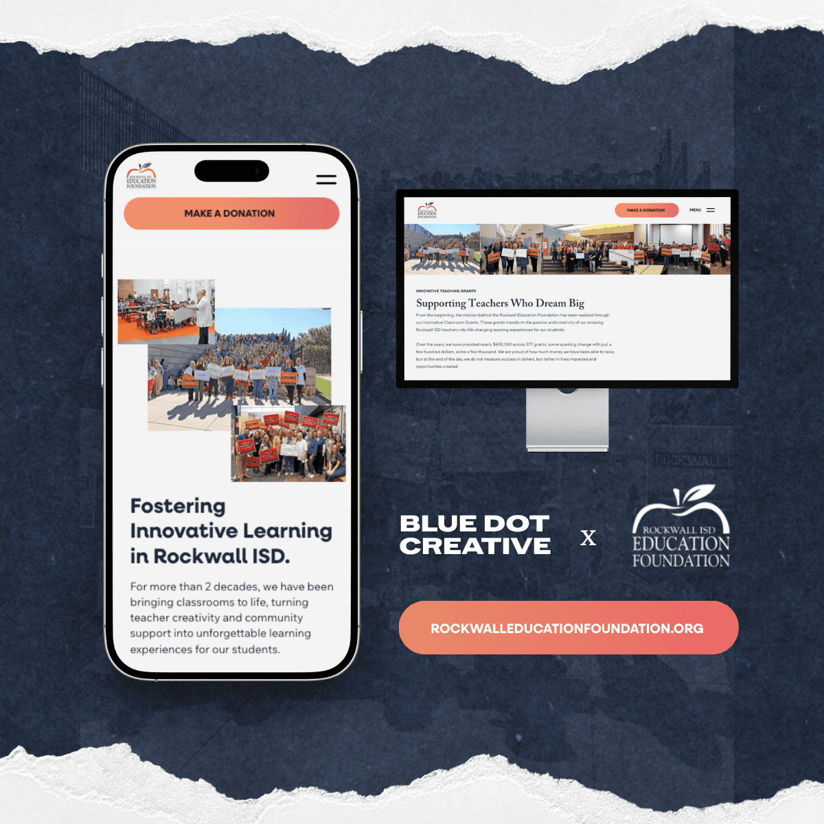
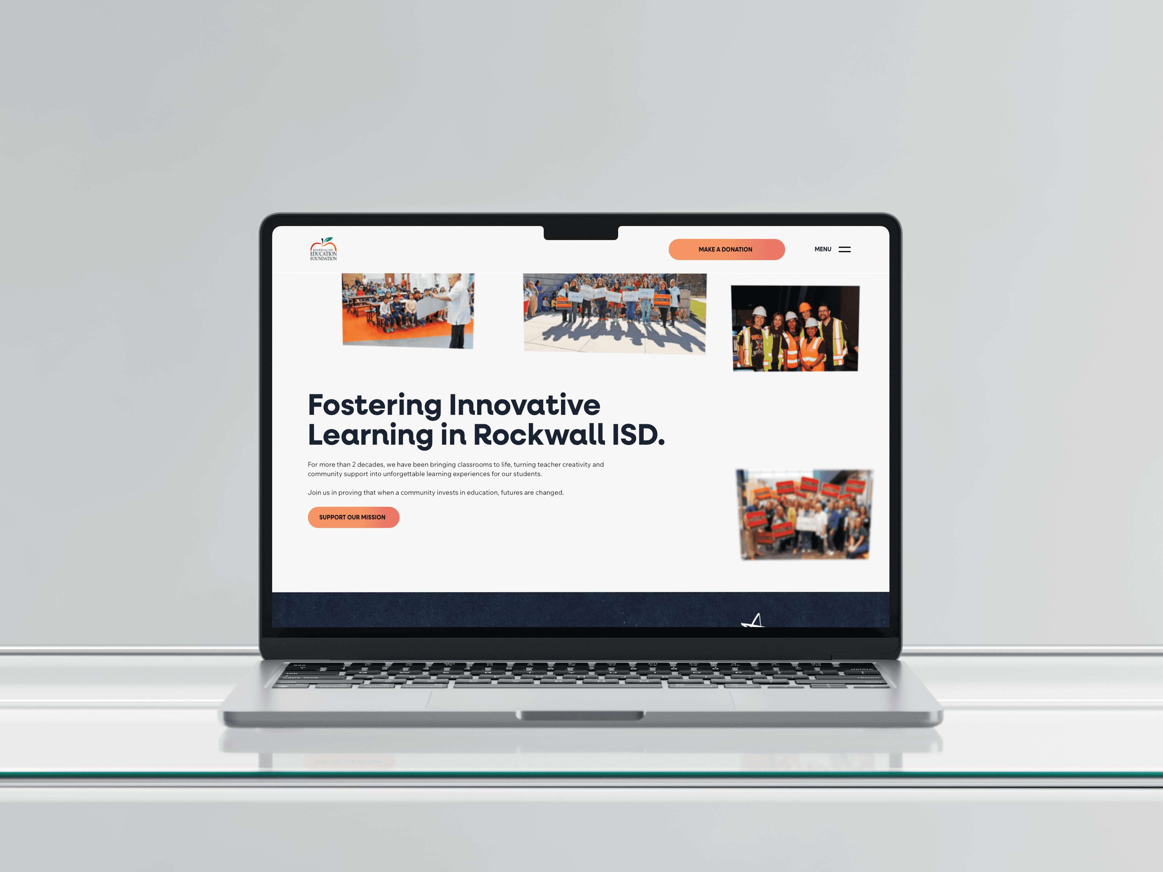


We reduced friction across content experiences, ensuring stories, events, and programs were accessible, intuitive, and easy to navigate.
Redefined Branding
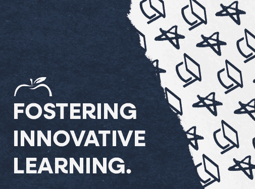
We decided to revamp the REF's branding without straying too far from what they had established. We moved towards including a deep blue color that ensured a neutrality between the red and orange colors that represent the two RISD high schools, and a paper + hand drawn visual style.
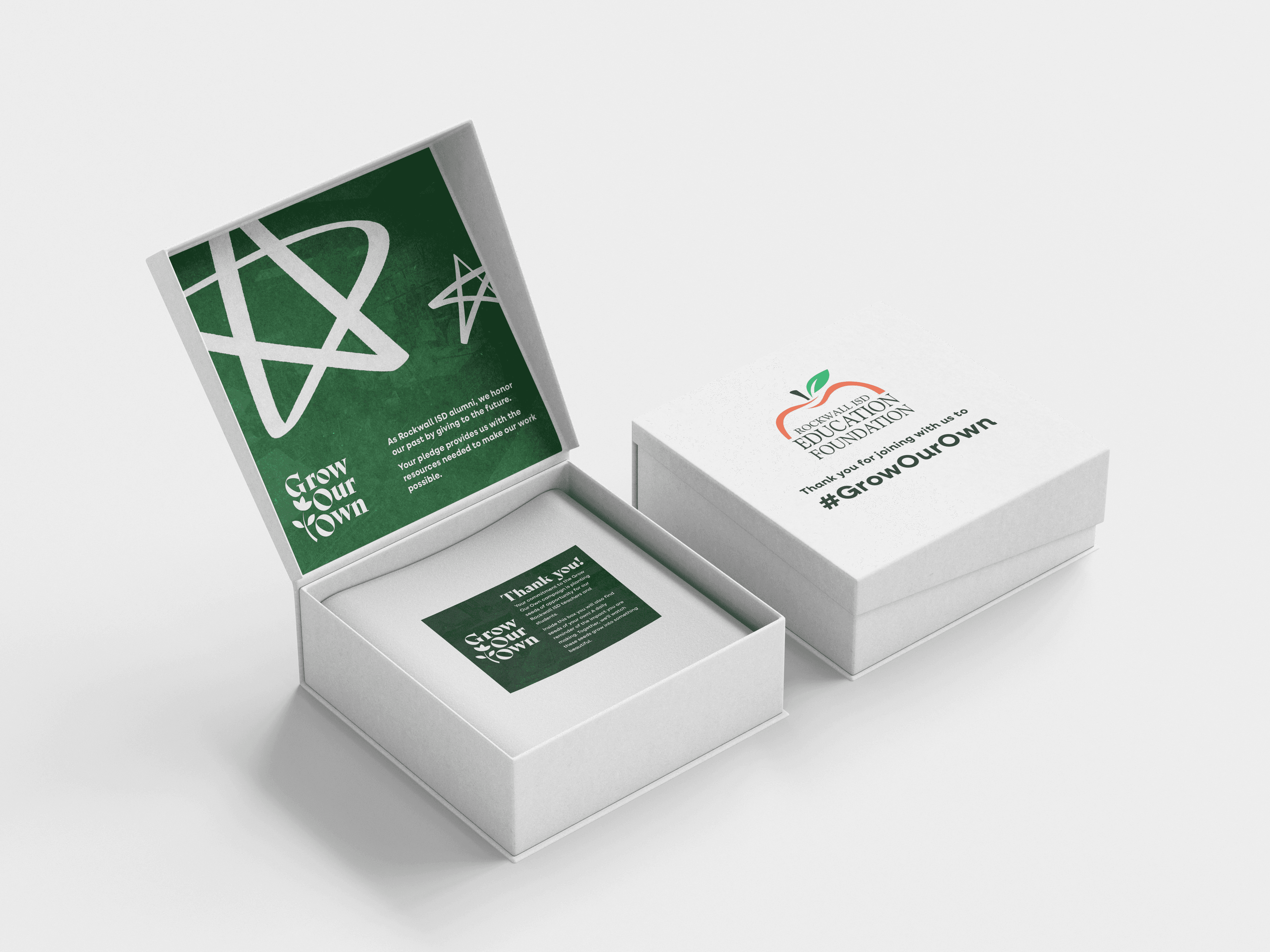
We are leading campaign ideation and execution that translates the Foundation’s programs from compelling concepts to cohesive and engaging designed to build awareness and deepen community support.
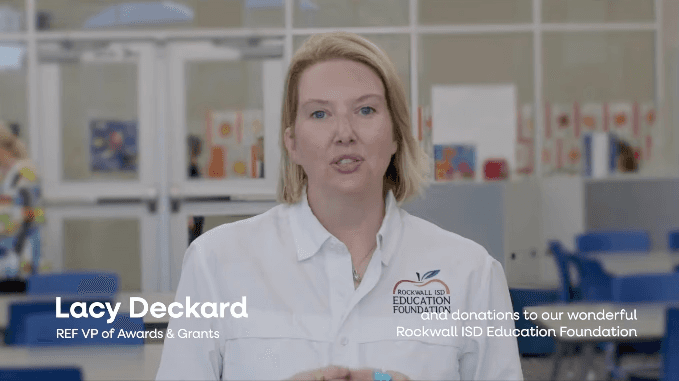
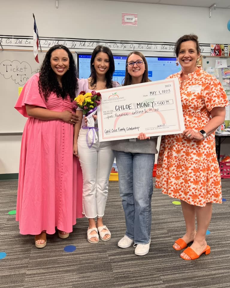
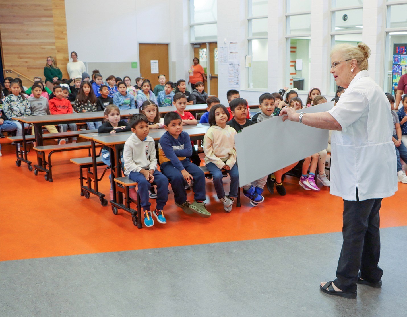
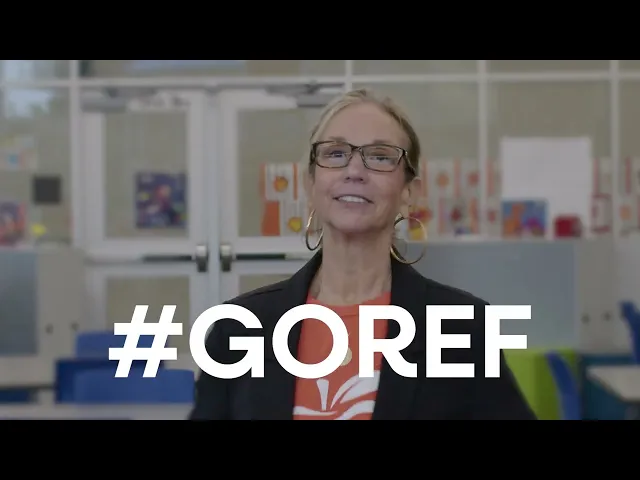
We captured and shaped the #REFExpress Prize Patrol through video, ensuring the moment felt authentic, celebratory, and aligned with the Foundation’s mission.